

Rodger Williams
July 5, 2014
Home educated students have long been recognized by research as scoring substantially higher than expected, on average, on nationally normed achievement tests. We will take a deeper look at the mechanics of how that works out in practice.
The students we consider here are all privately home educated. The family budget supplies the money for that education. Parents control the education process and the curriculum. These parents have willingly chosen to homeschool and are prepared to pay the personal price to do so.
Our data source is state-mandated, nationally-normed tests administered to Oregon homeschool students. Home educating parents are required to have their students tested by qualified neutral testers. It is the legally-required test score results that we analyze here.
Homeschool standardized test results
Test publishers “norm” standardized tests by trying them out on representative samples of students and then grading such that one percent of the students are expected to fall in each of 100 groups, called percentiles. So ten of those percentiles grouped together should have 10% of the students. E.g., 10% of the students would be expected to score in the 1-10 range, 10% should score in the 11-20 range, etc.
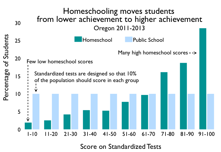
This chart shows an example of homeschool standardized test scores. The distribution of scores is skewed markedly towards the higher end of scores. There are fewer low scores than expected and more high scores than expected, compared with the normed national averages (labeled Public School in the chart). In fact the average score in this example for homeschool students — the median — is the 79th percentile rank, that is, 29 percentiles higher than the national average of 50 for all students.
Looking at the data, one gets the impression that some force is steadily moving the homeschooled students from lower-score buckets into higher-score buckets — much like a brisk wind blows leaves up against a fence.
The homeschool test score curve is the result of an underlying normal (bell-shaped) curve
To mechanically explain the homeschool shift towards high scores, we need to understand that there are two ways to view this data. The first view is of the normed test scores, themselves. We see that view in the graph above.
That first view is the result of the norming process, which translates an underlying measure of achievement into percentiles. The second view looks at the actual underlying measure of achievement.
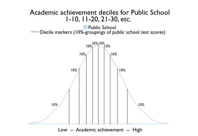
This graph shows the underlying scale of achievement for public school students. The vertical black dotted lines divide the student population into ten groups, depending on their academic achievement as measured by the tests.
The area under the curve represents the percentage of students, totaling 100%. The areas between vertical lines are all identical, with each group containing 10% of the students. Notice that the black dotted decile markers are spaced closer together where the curve is high and farther appart as the curve gets lower. This is to keep the enclosed area at 10%.
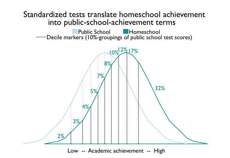
In this graph, the curve on the left shows the distribution of achievement for public school students (median of 50). The curve on the right shows the distribution of achievement for homeschool students (median of 79). Both distributions are normal, with the well-known bell curve.
Standardized achievement tests are normed in terms of the public school curve, as indicated by the vertical black dotted lines. We are interested here in homeschool scores, which the normed standardized tests report in terms of public school percentiles. We show our interest by connecting the black dotted lines to the green homeschool curve. The areas between the black dotted lines and under the green curve represent the percentage of homeschool students scoring in each decile.
Because the homeschool curve is shifted towards higher achievement, the homeschool standardized test scores show up as higher than expected. Only 2% of homeschooled students score in the lowest decile, while 32% score in the highest.
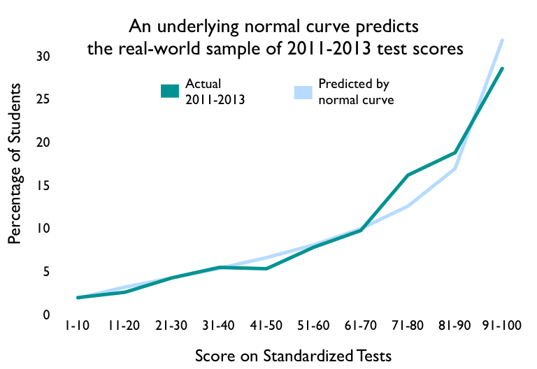
As this graph shows, the normed view of real-world scores gives decile percentages largely tracking those in the underlying achievement view (overlapping bell curves diagram). There are differences caused by the fact that our data is really just a sample out of the world-wide population of homeschooled students. Statisticians refer to this phenomenon as sampling variability. Smaller samples characteristically demonstrate more variability from the underlying distribution than larger samples.
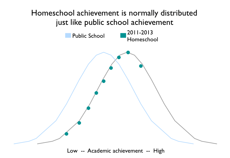
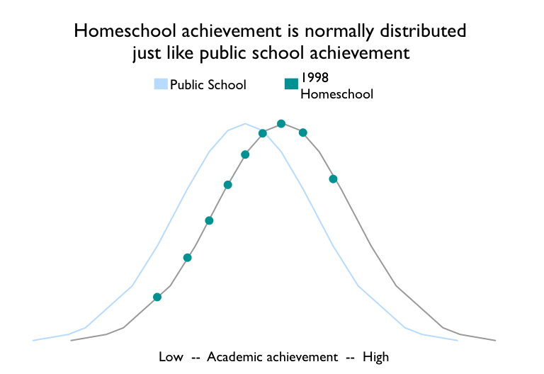
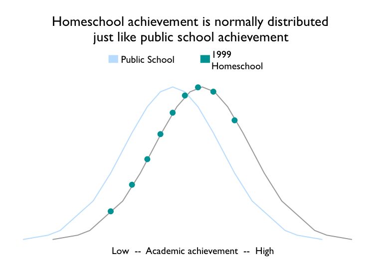
We can also plot the data from the normed view of real-world scores back onto the underlying achievement view. More data points on the left reflect the fact that we are plotting homeschool data normed to the public school curve, with only public school deciles available to plot. The data clearly conforms to a normal curve.
We have Oregon data from 1998 (median of 71) and 1999 (median of 73), which also conform to the normal curve.
Appendix: The Oregon data
The 1998 and 1999 Oregon data are composed of scores for all homeschooled students statewide. These are not samples. They are the score tallies for every homeschooled student in the state of Oregon.
Both years’ scores are approximated by a normal curve, with median scores at the 71st percentile and the 73rd percentile respectively. Normal curves are what we would expect from education achievement scores.
The 2011-2013 data is comprised of the scores for 20% of the homeschooled students in Oregon, as estimated by the state’s Education Service Districts (ESDs).
This is a respectable sample size. Homeschoolers turn in their test scores to the local ESD upon request of the ESD Superintendent. In 2011-2013, ESDs serving 20% of homeschooled students blanket-requested the scores in their district.
The other ESDs did not routinely request scores.
This dataset contains all tallied scores collected by ESDs in the state.
Is the 2011-2013 data valid? Or is it biased.
There are several reasons to believe it is valid:
1) The sample size is large: 20% of the students.
2) There is no reason to believe the sample is biased with regard to test scores.
The individual ESDs’ decisions whether or not to collect scores in their districts were internal, ESD-specific decisions.
These were likely driven by reasons related to efficient use of ESD resources.
If the decisions had been related to observed homeschool test scores, one would expect those ESDs with lower reported scores to be more prone to keep monitoring to make sure that homeschooled students in their district were being educated.
ESDs with higher scores would be less prone to keep collecting scores. This would bias the reported scores downward.
If this hypothesized bias related to test scores were true, the measured 79th percentile median would translate into even higher actual underlying scores.
3) The 2011-2013 data is approximated by a normal curve, just as the 1998 and 1999 datasets are.
There is no evidence of distortion in the curve that would be caused by bias in the reported test scores.
In summary, available evidence suggests this Oregon data is valid. There is no evidence suggesting it is not valid.
Data source: All Oregon data used in this study is available from the Oregon Department of Education.